
Mixed reality training & usability research
Company: University of Miami
Role: UX Designer
Timeline: 2023
Platform: HoloLens 2
Summary
The XR Assistant prototype was created with the purpose of evaluating the effectiveness of smart assistants for training purposes, using mixed reality headsets such as Microsoft HoloLens2 that allow the user to see digital content overlaid on their physical surroundings. This project consisted of two phases: phase one and phase two. Phase one consisted in assessing the UI elements of the screens with a few participants. Phase two consisted of doing two tasks with 10+ participants and informed the next iteration of the prototype’s UI and User experience.
Objectives
Create a prototype for usability testing, using Unity Engine and Microsoft HoloLens2
Perform usability tests to uncover opportunities for improvement and design and assess the overall user experience of the prototype
Methods: apparatus
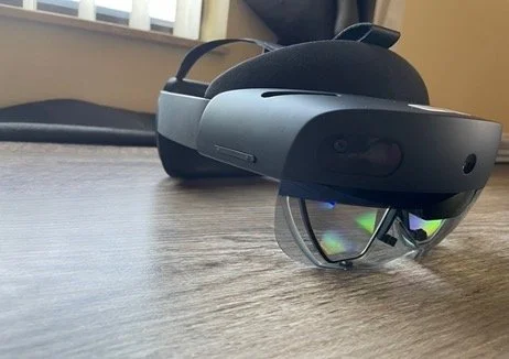
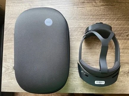
The headset used for the study was Microsoft HoloLens2, which is a Mixed Reality/AR device. It allows users to see digital content overlaid on a 3D (real world). Participants were trained with the headset prior to the study, including learning all gestures and interactions to manipulate holograms and screens.
Other Equipment used:
Qualtrics (demographic survey, post-test survey)
Unity Engine
Microsoft Office Suite (Test Plan, Data Analysis)
Cardboard geometric shapes (with magnetic sides)
White magnetic board
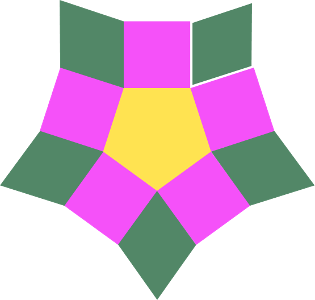
Task 1
11 shapes total; 11 steps
Similar in pattern
Expected to take less time to configure
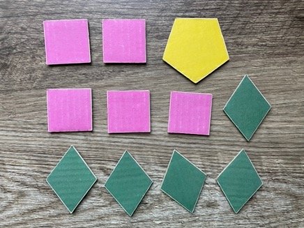
Final Configuration
Task 1 - User Flow
Final Configuration
Task 2
23 shapes total; 23 steps
Irregular shapes pattern
Similar colors to increase difficulty
Expected to take longer to configure
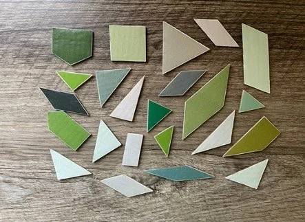
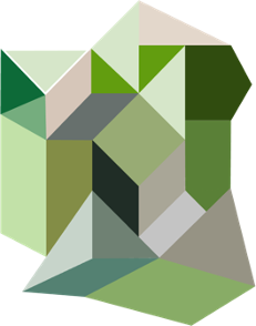
Final Configuration
Task 1 - User Flow
Phase one
1-3 participants
Exploratory; to assess UI of first iteration of prototype
Task 1 ONLY
Done in 1 week
User testing (Insights)
After using the original layout that I was instructed to create on Unity, I realized there were some problems with it, and we used the PHASE ONE tests to inform design decisions for a new layout.
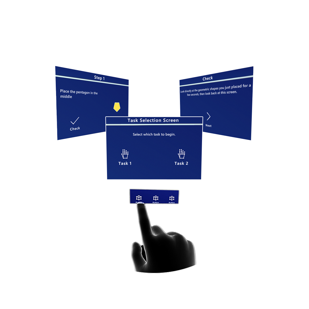
Original layout showing the ‘BACK’ and ‘NEXT’ buttons as well as centered-content approach.
Layout could be rearranged for better hiearchy
There were originally two main buttons: a ‘NEXT’ and ‘BACK’ buttons so users could have the freedom to backtrack if they aren’t sure about a step, or instructions
The problem was if users resized the screen too big or too small, the layout would shift and buttons could become either too small, or too big
As the shape became larger, the example image became smaller to fit the entire new shape into frame, so a new layout needed to be considered
Original layout showing the ‘BACK’ and ‘NEXT’ buttons as well as centered-content approach. Sample image in the middle confused users, thinking they could grab it.It was unclear to users whether or not they could interact with digital image
Some users tried to grab the digital image and try to overlay it on the white board as a direct reference to put the physical shapes, when they realized they couldn’t grab it, they expressed some frustration as it defied their mental model
Additionally, since users focused more on the example image, they ended up ignoring the written text; only using it when the image became to complex to follow (Only seen with Task 2)
Phase two
12 participants
To assess user experience and inform design changes
Task 1 and 2
Ongoing
Usability test summary
Insights
Written text used repetitive terms and unclear which specific shape to configure
This behavior was seen across most users. They paid attention to the example image instead of the written instructions, since they were repetitive terminology and not clear as to which next shape to configure where, etc. An opportunity for better UX writing, as well as perhaps a toggle to hide/show text could be considered to solve this issue.
Outline of ‘next’ shape had low saliency in some steps, due to colors being too similar
There is an opportunity to choose a different contrasting color for outlines, to indicate users which is the next shape to grab, since some shapes were very light in color, and the outline was white, so bad contrast confused some users.
Also using numbers on top of the next shape to be more clear can be considered to improve usability.
Manipulating the screens was sometimes difficult for some users
All users were given a tutorial with how to use the HoloLens2 screen before the main tasks. However, even after learning the gestures, some users still had difficulty grabbing the screen, especially since HoloLens2, seems to only allow users to grab items by specific areas (marked in RED) and users were trying to use the non-grabbable areas (marked in YELLOW)
Design suggestions
For potential next iteration of the app, prior to incorporating a new feature (AI Smart Component/Object recognition to help users when they make a mistake)
Old layout
In somes creens, especially in the beginning ones where the shape was small, and so was the image, there was too much white space. Also, some users expressed that since they were left-handed, and placed the screen on their preferred side, it would be nice to have the screen layout mirror to cater to their dominant hand.Proposed new layout
The new layout has a new button that allows users to flip the screen view, so the content is positioned where they feel most comfortable with, as well as divide the screen into three panels: one top header panel, and two identical middle panels, one with the written text and button, and the other one with the example image. This new changes will be tested to evaluate user’s perception and usability.